Chapter 4 Visualization
here advanced plots means to use looped data. like from repeated measures of multiple analysis saved in multiple data sets.
4.1 Basic Plots
This section aims to guide you through data visualization using ggplot2 in R. I will cover basic to advanced plots, focusing on various aspects of ggplot2. If the package is not already installed, the following code will install it for you.
Now, let us create the initial plot as a starting point. I am using the iris dataset as an example:
# Load the iris dataset
data <- iris # "iris" is installed in R per default
# Initialize the ggplot object
p <- ggplot(data)
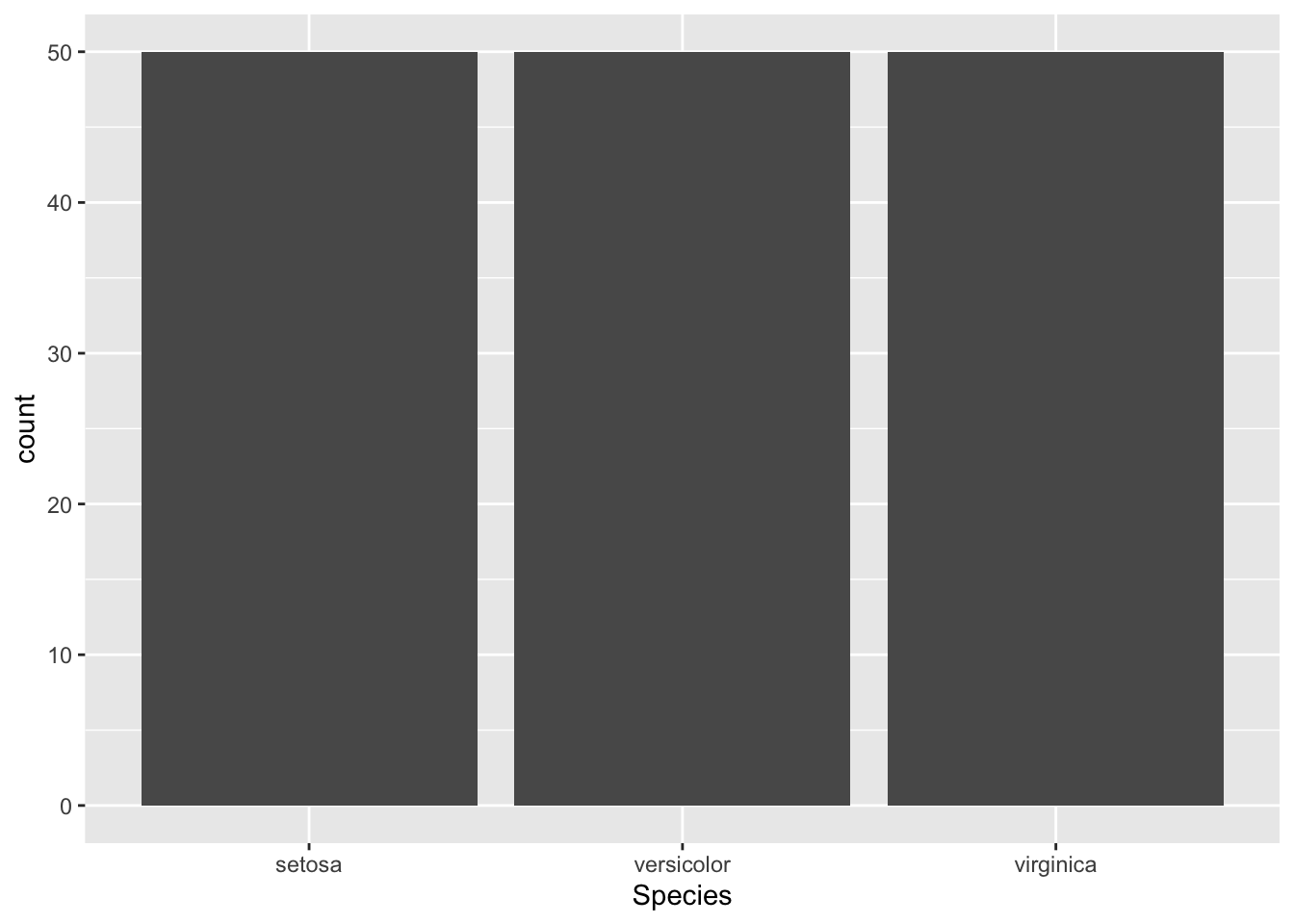
p
Figure 4.1: Initialize ggplot for a scatter plot
In ggplot2, graphical elements are added to a plot progressively. If you want for example modify the default background color of the initial plot, you need to add elements that replace the background rather than (intuitively) subtracting it.
In the following, I present some basic plot examples, all starting from the previously created starting element p.
4.1.1 Scatter plot
Firstly, we add aesthetic mappings for our variables of interest:
Figure 4.2: Add aesthetic mappings
Then, we add points to the scatter plot:
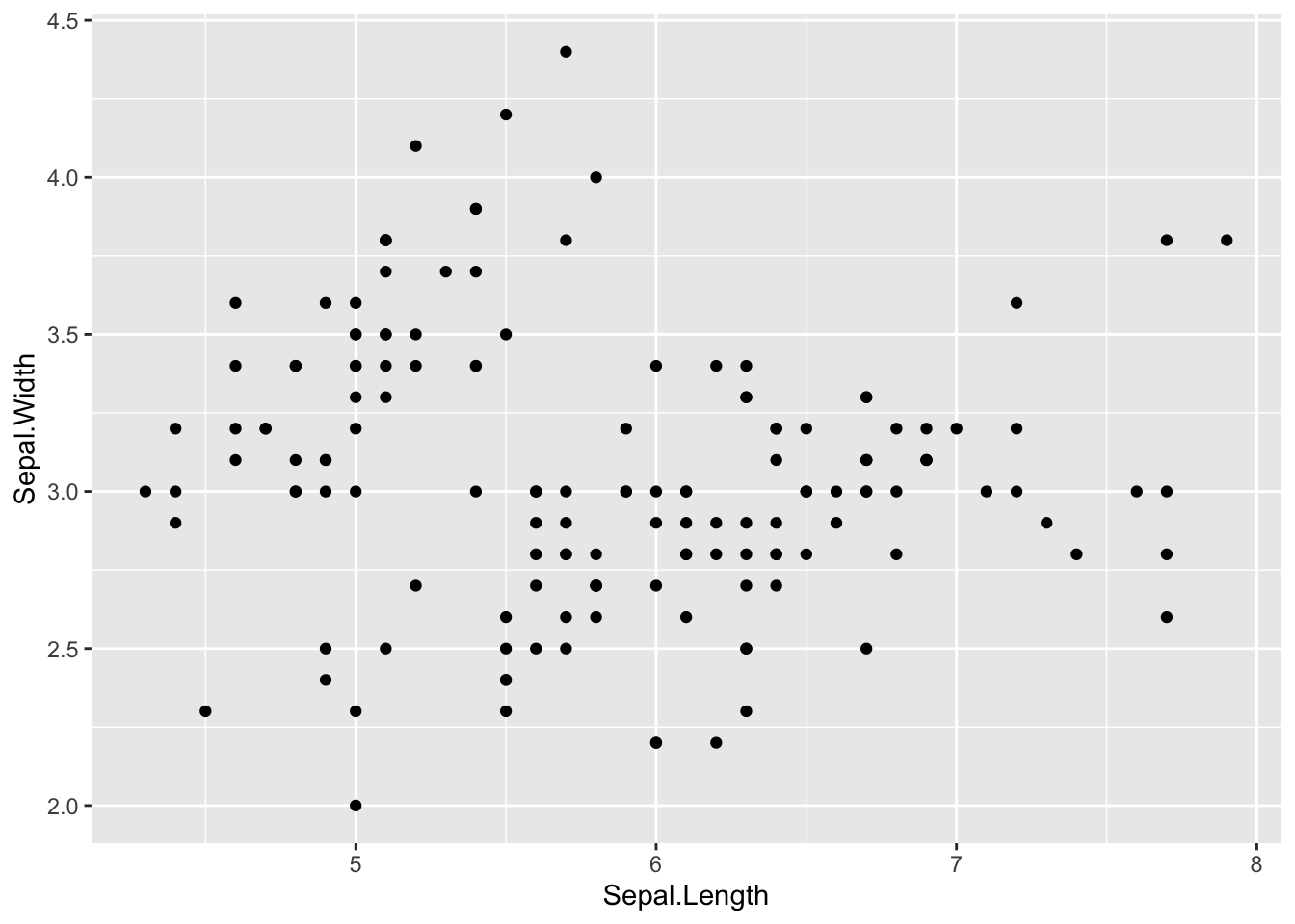
Figure 4.3: Final scatter plot
4.1.1.1 Adding regression line and confidence interval
Now, let us add a regression line along with a confidence interval.
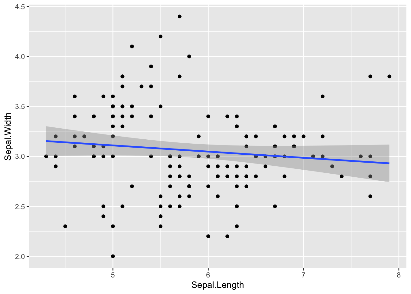
Figure 4.4: Add regression line and confidence interval
4.1.1.2 Changing background color
To change the background color of the plot, you can use a theme and add it to the plot. I this example I use a black and white theme (theme_bw()). However, one can find suiting alternatives themes using the help(theme_bw)function.
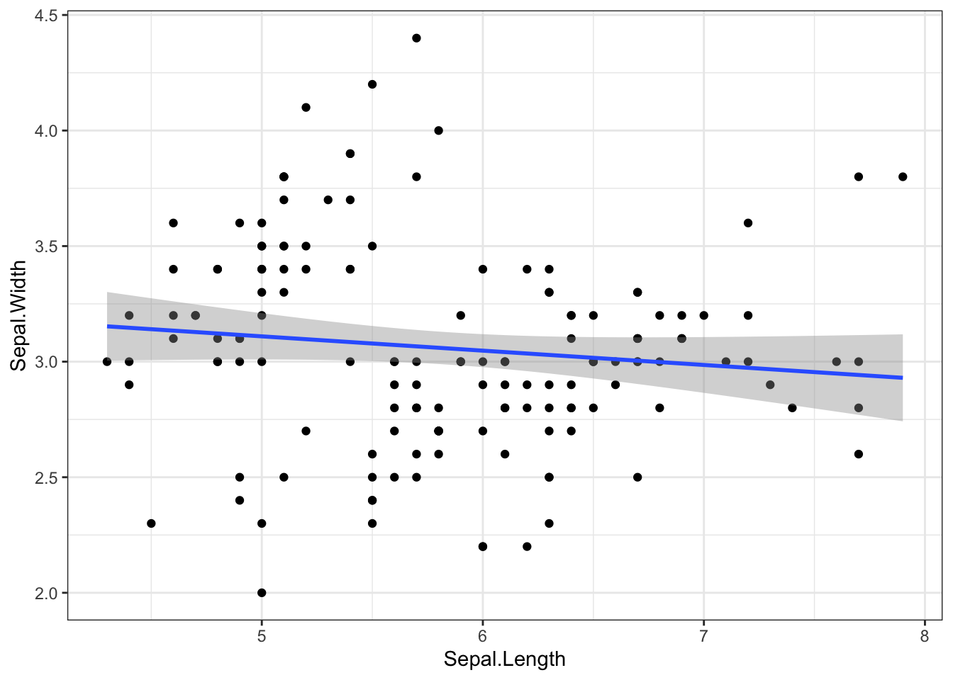
Figure 4.5: Change background color
4.1.1.3 Adding labels and titles
To make our plot more informative, let’s add appropriate labels and titles.
p3 <- p2 + labs(y = "Sepal Width (cm)", x = "Sepal Length (cm)", title = "Relationship Between Sepal Width and Sepal Length")
p3
x = Sepal.Length, y = Sepal.Width)
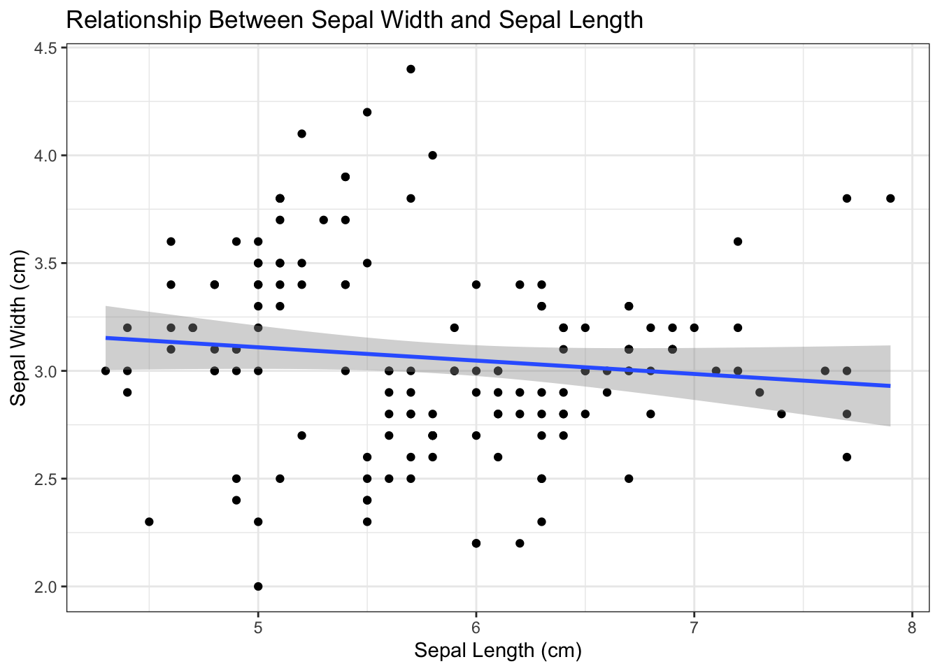
Figure 4.6: Add labels and titles
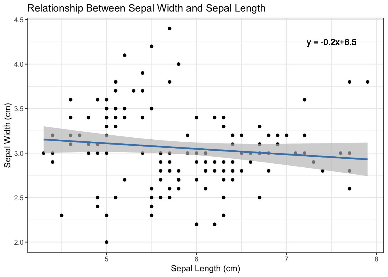
4.1.1.4 Adding regression equation
To add the regression equation to the plot, we first need to calculate it.
Then, we add the equation to the plot:
equation <- paste("y = ", round(fit$coefficients[1], 2), " + ", round(fit$coefficients[2], 2), "x")
p4 <- p3 + geom_text(aes(x = 7.5, y = 4.25, label = equation))
p4
Figure 4.7: Add regression equation
4.1.1.5 Faceting by another variable
To split the plot into subplots, you can use faceting. We allow different ranges for each subplot. For this you can utilize the scales argument in facet_grid and set it to scales = "free".
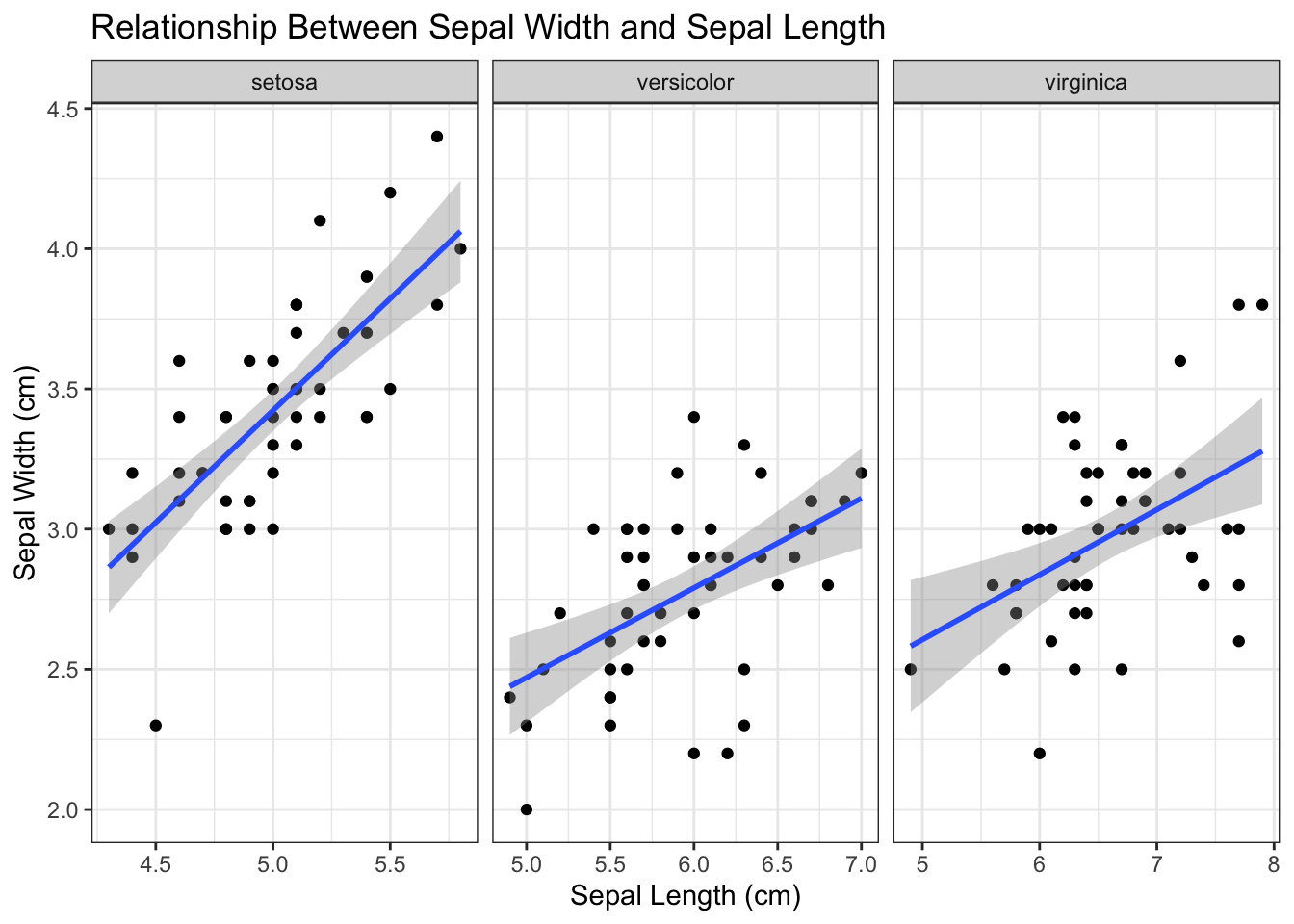
Figure 4.8: Facet by species
4.1.2 Bar plot
Firstly, let us set (or overwrite) another element to prepare the plot and to add aesthetic mappings for our variables:
Figure 4.10: Initialize ggplot for bar plot
4.1.2.2 Changing background color
To change the background color of the bar plot, we this time proceed with a theme from the help(theme_bw)function. From the help function, I selected the theme_test element which is added to the plot as follows:
Figure 4.12: Change background color
4.1.2.3 Adding labels and titles
To make the bar plot more informative, let’s add appropriate labels and titles.
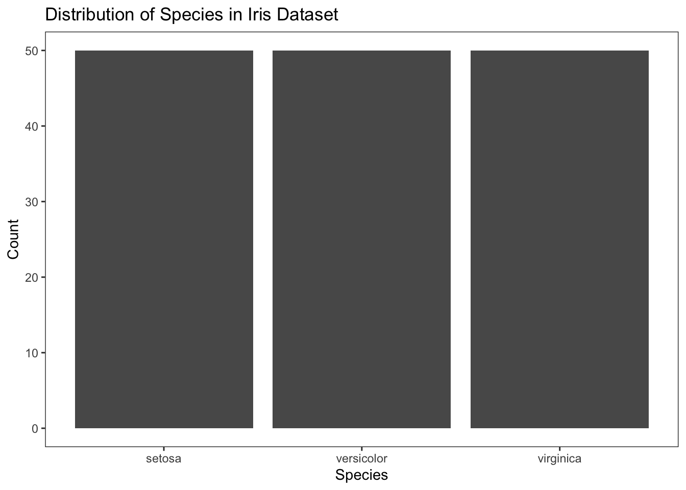
Figure 4.13: Add labels and titles
4.1.2.4 Color customization
To customize the colors of the bars, you can proceed as follows:
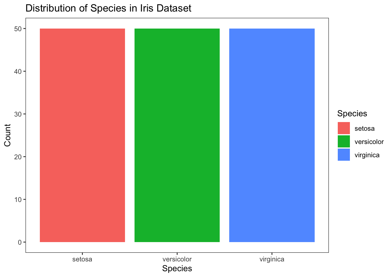
Figure 4.14: Customize colors
To set fixed colors for each species, you can use the scale_fill_manual() function. This allows you to map specific colors to each level of the Species variable.
# Define a named color vector
color_vector <- c("setosa" = "lightgrey", "versicolor" = "darkgrey", "virginica" = "darkgreen")

# Use the color vector in scale_fill_manual()
p5 <- p4 + scale_fill_manual(values = color_vector)
p5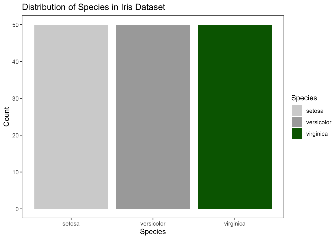
Figure 4.15: Customize colors with fixed values
4.1.3 Boxplot
Boxplots provide a way to visualize the central tendency and spread of a numeric variable across different levels of a categorical variable. They also show potential outliers.
4.1.3.1 Create customized Boxplot within one element
First, we prepare the plot object. We set (or overwrite) another element to prepare the plot and to add aesthetic mappings for our variables. We will again use the iris dataset for this example. Unlike previous examples, we now start using the ggplot2package in combination with its adding feature +. This allows us to complete a plot within one object or code chunck.
data <- iris # In this example, I will again use the iris data
library(ggplot2)

p <- ggplot(data)
p <- p + aes(x = Species, y = Sepal.Length)

# instead of this:
p <- ggplot(data)
p <- p+ aes(x = Species,y = Sepal.Length)
p1 <- p + geom_boxplot()
p2 <- p1 + labs(y = "Sepal Length (cm)", x = "Species", title = "Distribution of Sepal Length Across Species")
p3 <- p2 + geom_boxplot(outlier.shape = 8, outlier.color = "red")
p4 <- p3 + facet_grid(. ~ Species)


# we use the `+` functionality
# note that we can take out the p1 element from above, as we add another geom_boxplot element anyway (p3 from above). This leads to:


p <- ggplot(data) +   #Create the boxplot
      aes(x = Species,y = Sepal.Length) +   #Add variables to plot
      labs(y = "Sepal Length (cm)", x = "Species",
      title = "Distribution of Sepal Length Across Species") + #Adding labels and titles
      geom_boxplot(outlier.shape = 8, outlier.color = "red") + #Customizing outliers
        facet_grid(. ~ Species)   #Faceting by another variable
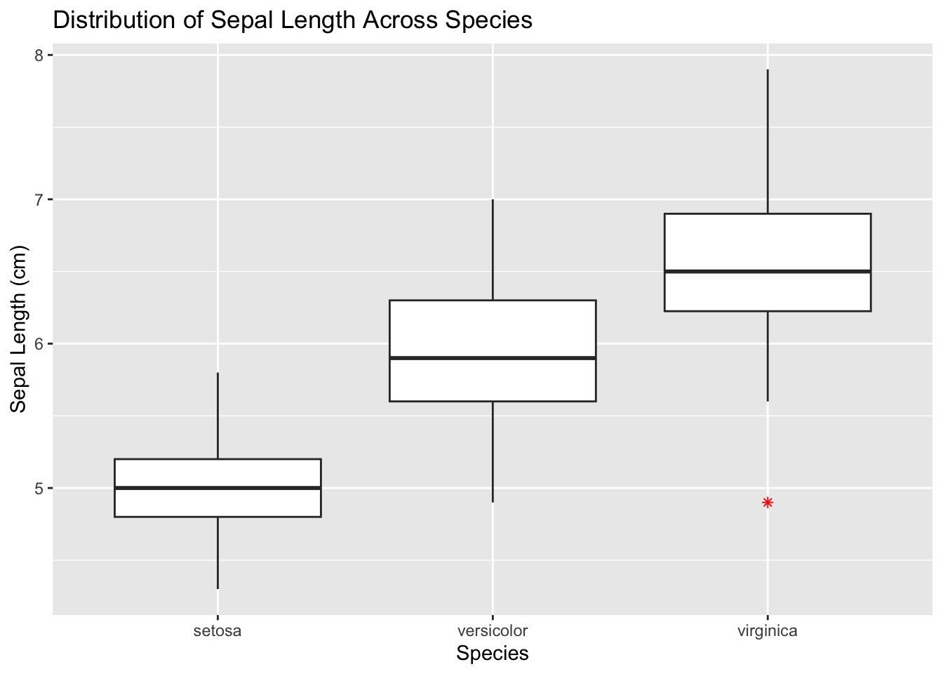
Figure 4.16: Initialize ggplot for box plot
4.1.4 Histogram
Histograms are useful for visualizing the distribution of a single numerical variable.
4.1.4.1 Initialize ggplot for Histogram
First, set up the basic ggplot object. We will continue using the iris dataset for consistency.
library(ggplot2)
data <- iris
p <- ggplot(data)+
      aes(x = Sepal.Length)+    #Add aesthetic mappings
      geom_histogram(binwidth = 0.5)+   #Create the histogram
      labs(y = "Frequency", x = "Sepal Length (cm)", title = "Distribution of Sepal Length")    #Adding labels and titles

p
## `stat_bin()` using `bins = 30`. Pick better value with `binwidth`.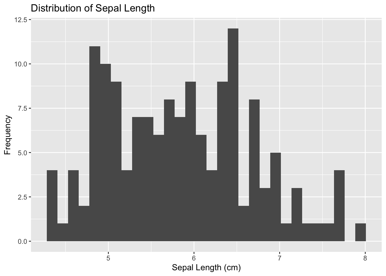
Figure 4.17: Initialize ggplot for histogram
4.1.5 Violin Plot
Violin plots combine the features of box plots and density plots, providing a more comprehensive view of the data distribution.
4.1.5.1 Initialize ggplot for Violin Plot
First, initialize the ggplot object. For demonstration, we’ll continue using the iris dataset.

Figure 4.19: Initialize ggplot for violin plot
4.1.5.2 Add Aesthetic Mappings
Next, specify the aesthetic mappings for the variables.
Figure 4.20: Add aesthetic mappings for violin plot
4.1.5.3 Create the Violin Plot
Add the violin layer to the plot using geom_violin().
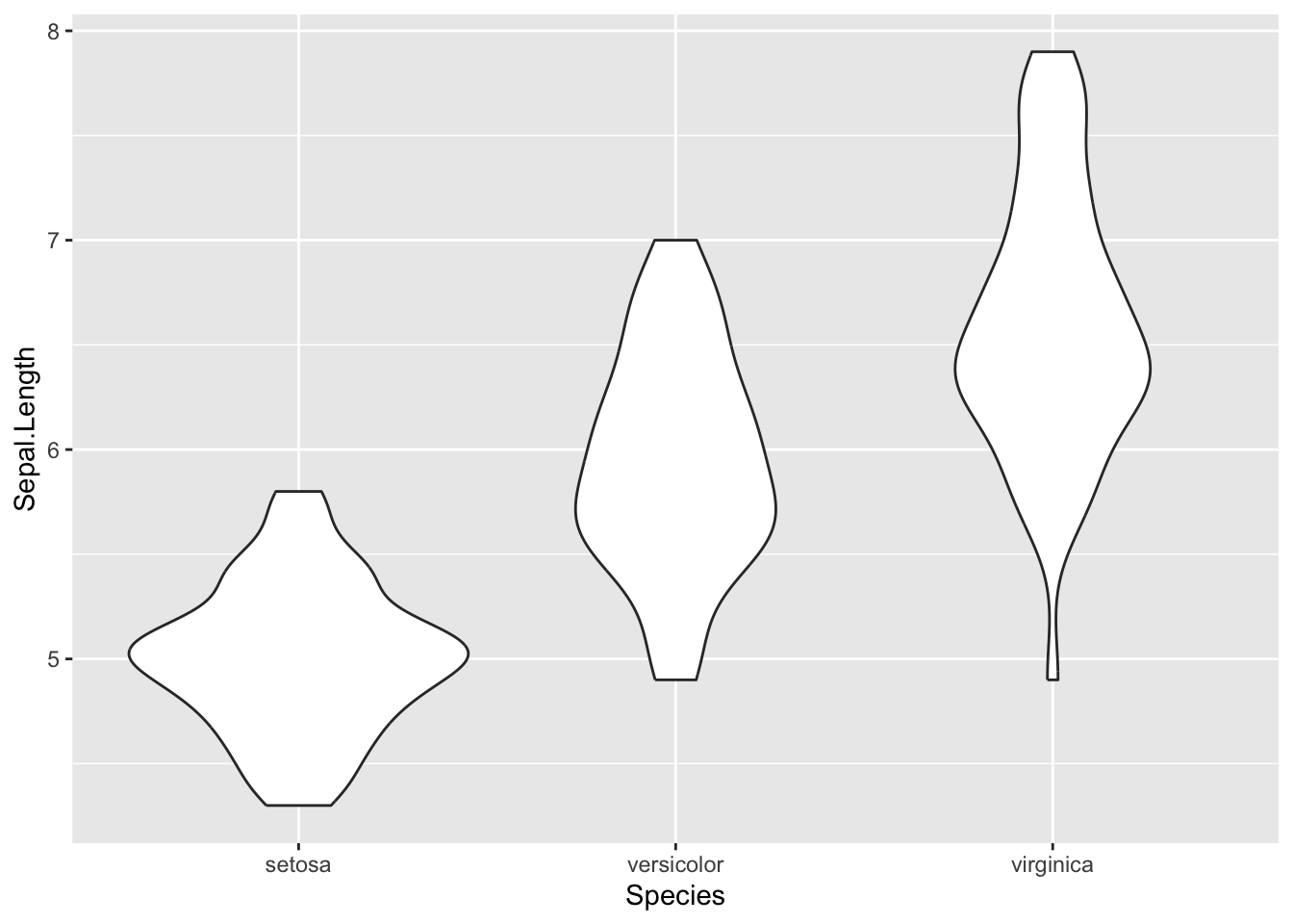
Figure 4.21: Final violin plot
4.1.5.4 Customize Colors
To customize the colors, you can use the fill argument inside aes().
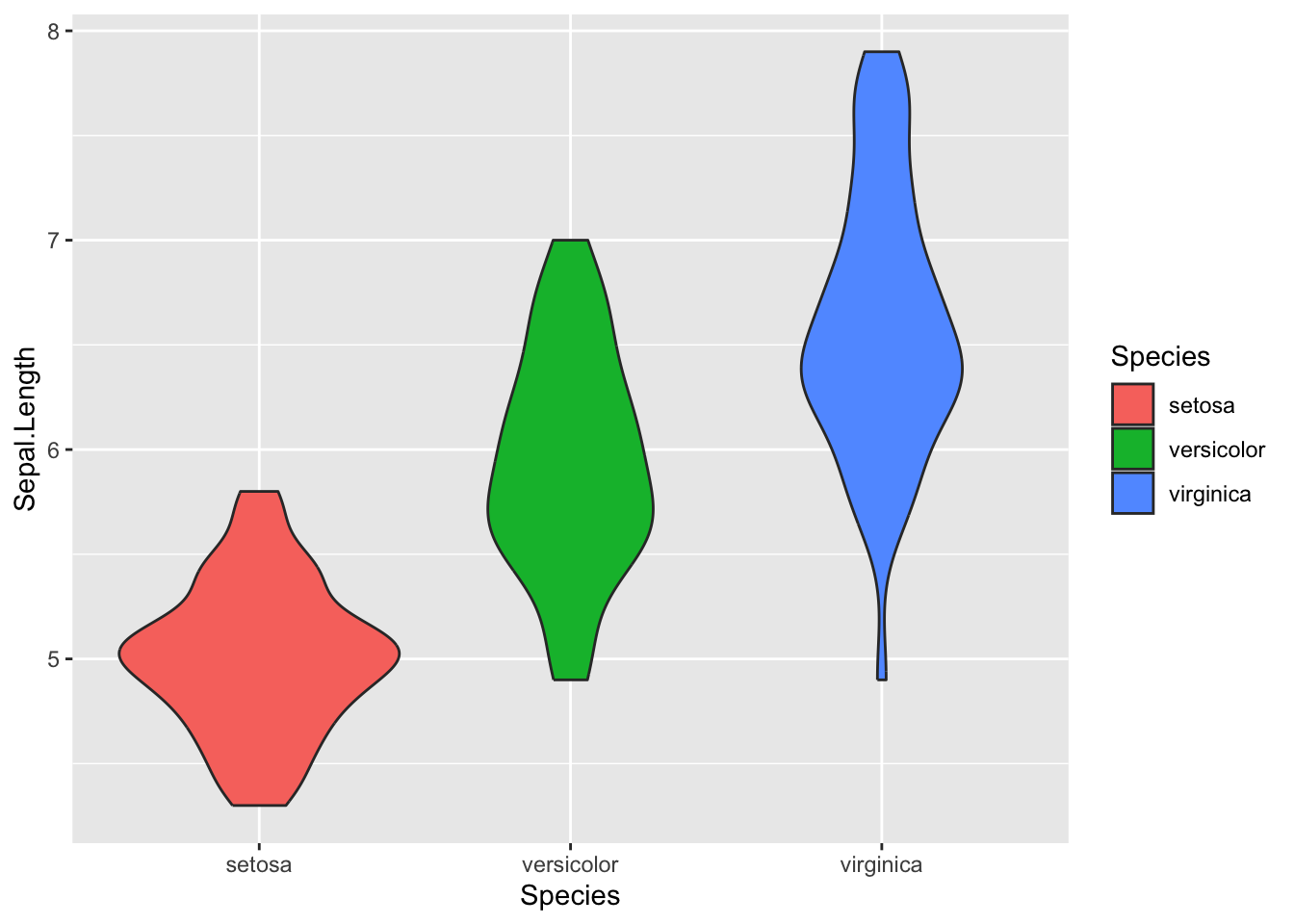
Figure 4.22: Customize colors for violin plot
4.1.5.5 Add Boxplot Inside Violin Plot
For additional context, you can include a boxplot inside the violin plot.

Figure 4.23: Add boxplot inside violin plot
This should provide a comprehensive guide for creating and customizing violin plots using ggplot2 in R.
Certainly, let’s delve into the area plot, which is useful for visualizing quantitative data with a continuous domain. It’s particularly useful for understanding the distribution of numerical values over a variable.
4.1.6 Area Plot
Area plots are useful for comparing two or more variables over time or other continuous metrics.
4.1.6.1 Initialize ggplot for Area Plot
Firstly, we initialize the ggplot object. Here, we’ll use the economics dataset that comes with ggplot2.

Figure 4.24: Initialize ggplot for area plot
4.1.6.2 Add Aesthetic Mappings
Specify the aesthetic mappings, typically x and y variables, for the area plot.
Figure 4.25: Add aesthetic mappings for area plot
4.1.6.3 Create the Area Plot
To actually make the area plot, we use geom_area().
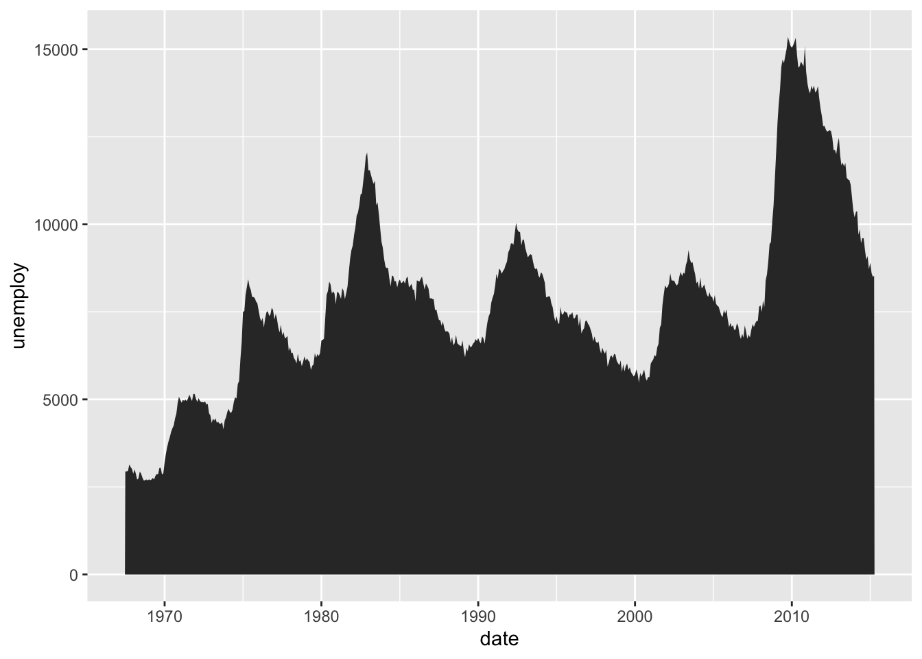
Figure 4.26: Final area plot
4.1.6.4 Customize the Fill Color
Let us customize the fill color of the area below the line.
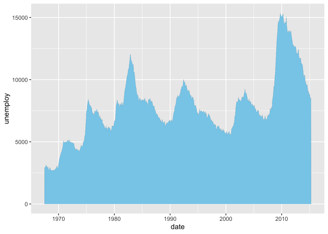
Figure 4.27: Customize fill color for area plot
4.1.6.5 Add Titles and Labels
Add informative titles and labels to make the plot more understandable.
p_area3 <- p_area2 + labs(title="Unemployment Over Time", x="Date", y="Number of Unemployed")
p_area3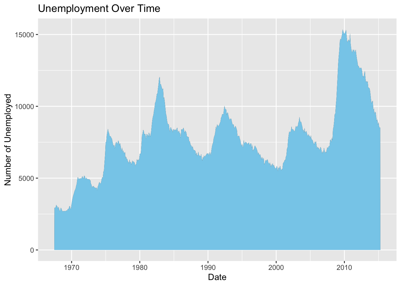
Figure 4.28: Add titles and labels to area plot
This completes the area plot tutorial. It covers initialization, aesthetic mappings, plot creation, fill customization, and labeling.
4.2 Advanced plots
Explain what advanced pots are. Here I focus not only on individual plots for advanced users (e.g., Heatmap, animated plots etc.), I also explain how to display multiple plots in a signle figure and also how to create plots in a loop.
4.2.1 Creating multiple plots side-by-side
To showcase multiple plots side-by-side, you can use the plot_grid function from the cowplot package. In the provided documentation, we have three individual plots representing a boxplot, histogram, and scatter plot with a regression line. The goal is to combine and display them in a single plot with a shared set of axes.
4.2.1.1 List of individual plots
data <- iris
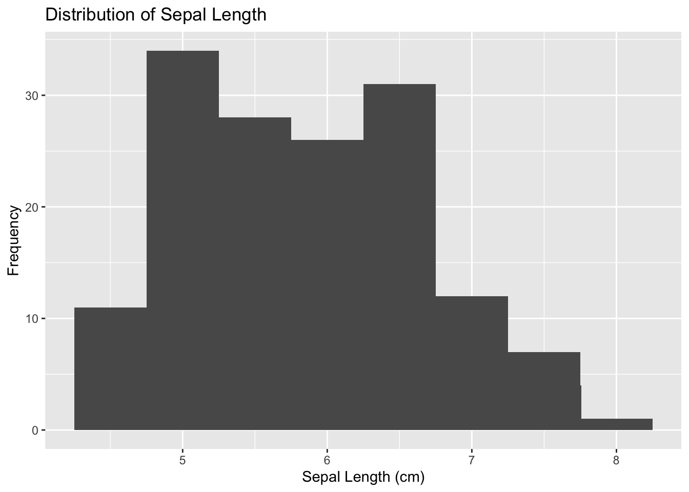
# Create a histogram
p1 <- ggplot(data, aes(x = Sepal.Length)) +
geom_histogram(binwidth = 0.5) +
labs(y = "Frequency", x = "Sepal Length (cm)",
title = "Distribution of Sepal Length") +
theme_bw()
# Create a boxplot
p2 <- ggplot(data, aes(x = Species, y = Sepal.Length)) +
geom_boxplot(outlier.shape = 8, outlier.color = "red") +
labs(y = "Sepal Length (cm)", x = "Species",
title = "Distribution of Sepal Length Across Species") +
theme_bw()
# Create a scatter plot with a regression line
p3 <- ggplot(data, aes(x = Sepal.Length, y = Sepal.Width)) +
labs(y = "Frequency", x = "Sepal Length (cm)", y = "Sepal Width (cm)") +
geom_point() +
geom_smooth(method = "lm", formula = "y ~ x") +
theme_bw()
# Combine individual ggplot objects into a list
plots_list <- list(p1, p2, p3)4.2.2 Combine and display plots
# Install and load cowplot if not already installed
if (!requireNamespace("cowplot", quietly = TRUE)) {
  install.packages("cowplot")
}

library(cowplot)


# Arrange and display the plots in a grid with 3 columns
grid.arrange(grobs = plots_list, ncol = 3)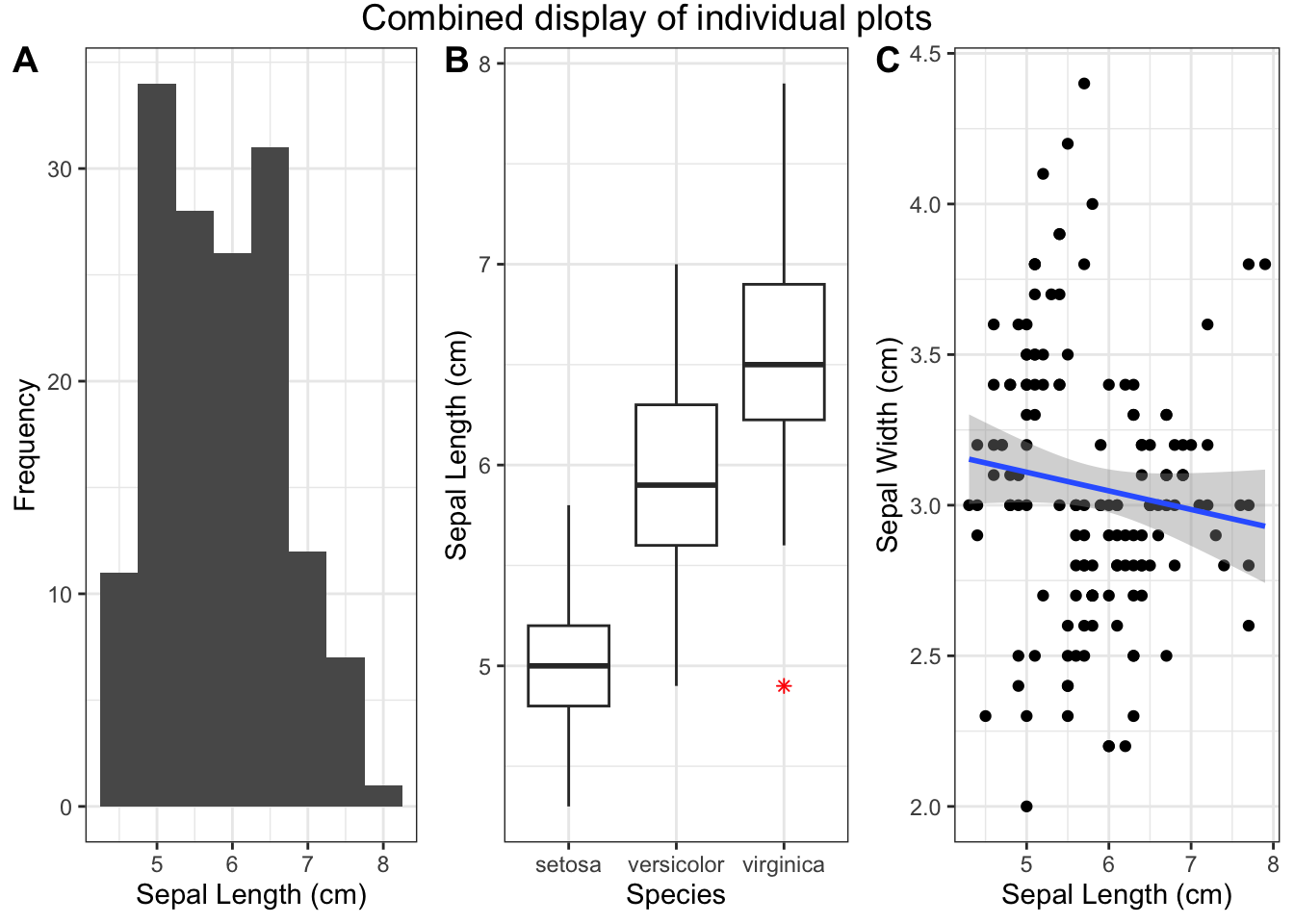
Figure 4.29: Combined display of individual plots
Note Adjust the number of columns (ncol) based on your layout preferences. The resulting combined plot showcases the distribution of sepal length across different species in the Iris dataset.
4.2.3 Heatmap Plot
Heatmaps help in visualizing the three-dimensional data in two dimensions using colors.
4.2.3.1 Initialize ggplot for heatmap plot
First, load the ggplot2 package and initialize the ggplot object. For this example, let’s use the mtcars dataset to create a heatmap of the correlation matrix.
library(ggplot2)
data_corr <- as.data.frame(as.table(cor(mtcars)))
p_heatmap <- ggplot(data_corr)
p_heatmap
Figure 4.30: Initialize ggplot for heatmap plot
4.2.3.2 Add Aesthetic Mappings
Specify the aesthetic mappings for the variables.
Figure 4.31: Add aesthetic mappings for heatmap plot
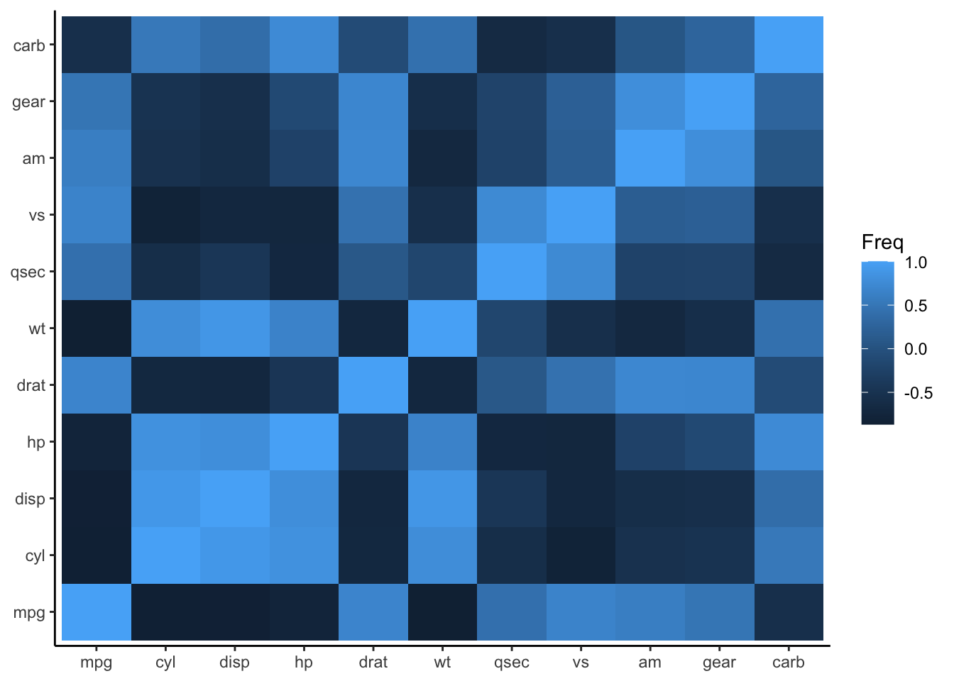
4.2.3.4 Customize the color scale
To customize the color scale, employ the scale_fill_gradient() function.
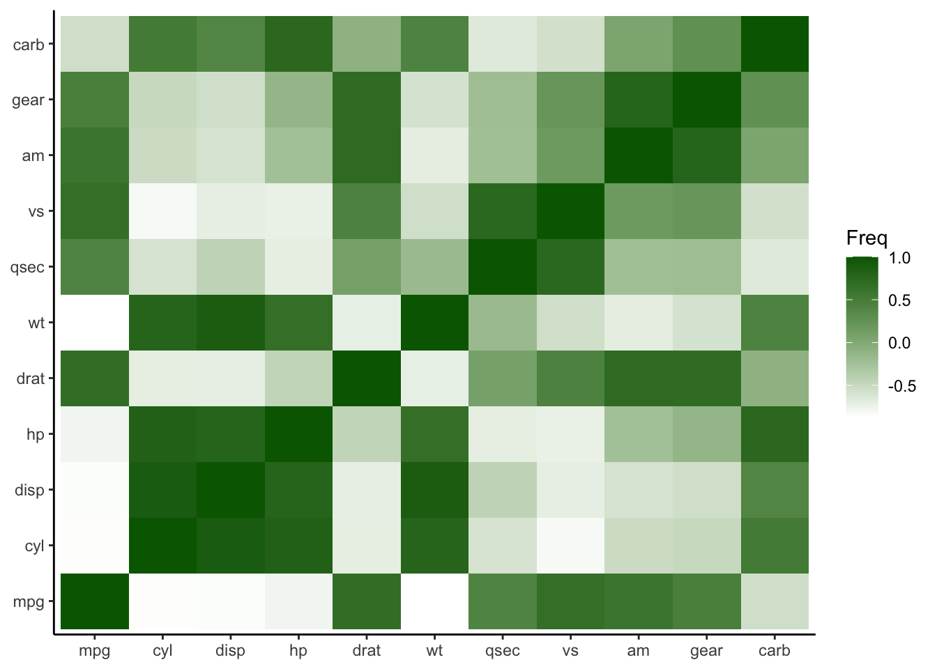
Figure 4.33: Customize the color scale for heatmap plot
4.2.3.5 Add Text Labels
To add text labels to the tiles, use geom_text().
p_heatmap3 <- p_heatmap2 + geom_text(aes(label = sprintf("%.2f", round(Freq, digits = 2))), vjust = 1)
p_heatmap3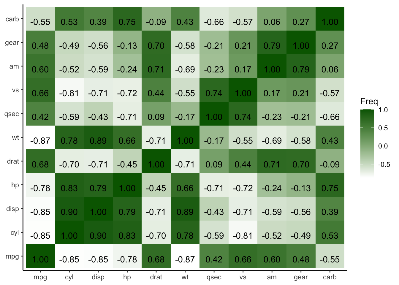
Figure 4.34: Add text labels to heatmap plot
4.2.3.6 Adapt lower diagnale of the plot
In the preceding heatmap, one could notice the redundancy in coefficient display—present in both the upper and lower diagonals. To optimize space and reduce redundancy, I propose overwriting the lower diagonal. For that, we first reproduce the heatmap from a
correlation matrix, which we can later further optimize. Additionally, let us set the lower end to red. We can achieve this by
using scale_fill_gradient2 instead of scale_fill_gradient, thereby setting low, mid, and high colors.
4.2.3.6.1 Heatmap from correlation matrix
# Generate correlation matrix
cor_matrix_pearson <- cor(mtcars)

# Convert correlation matrix to a data frame
cor_matrix_pearson <- as.data.frame(as.table(cor_matrix_pearson))

# Initialize ggplot for heatmap plot
p_heatmap_matrix <- ggplot(cor_matrix_pearson) +
                      aes(x=Var1, y=Var2, fill=Freq)+
                      geom_tile()+
                      labs(x = NULL, y = NULL)+
                      theme_classic()+
                      scale_fill_gradient2(name = "PM-correlation", low = "red", mid = "white", high = "darkgreen")+
                      geom_text(aes(label = sprintf("%.2f", round(Freq, digits = 2))), vjust = 1)
4.2.3.6.2 Additional corrmatrix with Yule’s Q diagonal
To overwrite the lower diagnole, I exemplary display the Yule’s Q index (note that this index is only suitable for dichotomous variables). For illustrative purposes, I dichotomize the variables based on the median, acknowledging the associated information loss.
The subsequent process involves dichotomizing the data, initializing a Yule’s Q matrix, calculating Yule’s Q coefficients for each variable pair, and converting the matrix into a data frame for enhanced analysis.
# Convert values below their column's median to 0 and those above to 1
binary_grouped_data <- mtcars
for (i in 1:ncol(binary_grouped_data)) {
  med <- median(binary_grouped_data[, i], na.rm = TRUE)
  binary_grouped_data[, i] <- ifelse(binary_grouped_data[, i] < med, 0, 1)
}

# Convert the matrix to a dataframe
binary_grouped_data <- as.data.frame(binary_grouped_data)

# Initialize an empty matrix for Yule's Q
yulesQ_matrix <- matrix(0, nrow = ncol(binary_grouped_data), ncol = ncol(binary_grouped_data))
colnames(yulesQ_matrix) <- colnames(binary_grouped_data)
rownames(yulesQ_matrix) <- colnames(binary_grouped_data)

# Calculate Yule's Q for each pair
for (i in 1:(ncol(binary_grouped_data)-1)) {
  for (j in (i+1):ncol(binary_grouped_data)) {
    A <- binary_grouped_data[, i]
    B <- binary_grouped_data[, j]
    a <- sum(A & B, na.rm=TRUE)
    b <- sum(A & !B, na.rm=TRUE)
    c <- sum(!A & B, na.rm=TRUE)
    d <- sum(!A & !B, na.rm=TRUE)
    Q <- (a*d - b*c) / (a*d + b*c)
    yulesQ_matrix[i, j] <- Q
    yulesQ_matrix[j, i] <- Q
  }
}


# Convert to a data frame
cor_matrix_yules <- as.matrix(as.table(yulesQ_matrix))
4.2.3.6.3 Initialize ggplot for combined heatmap
Next, we build a combined correlation matrix with the upper diagonal containing the initial pearson correlations and in the lower diagnole the Yule’s Q coefficients. In this specific use case rows contain NaN values, which are omitted. By implementing these measures, the resulting combined heatmap will offer a more comprehensive representation, incorporating both Pearson correlations and Yule’s Q coefficients.
# Initialize the combined matrix with the same dimensions and names as pearson_matrix (which has the desired order)
combined_matrix <- matrix(0, nrow = ncol(cor_matrix_pearson), ncol = ncol(cor_matrix_pearson))
colnames(combined_matrix) <- colnames(cor_matrix_pearson)
rownames(combined_matrix) <- colnames(cor_matrix_pearson)

# Populate upper diagonal with Pearson correlations
combined_matrix[upper.tri(combined_matrix)] <- cor_matrix_pearson[upper.tri(cor_matrix_pearson)]

# Populate lower diagonal with Yule's Q
combined_matrix[lower.tri(combined_matrix)] <- cor_matrix_yules[lower.tri(cor_matrix_yules)]

# Diagonal entries represent perfect Pearson correlation
diag(combined_matrix) <- 1

# Convert correlation matrix to a data frame
data_corr_matrix <- as.data.frame(as.table(combined_matrix))

# Remove rows with NaN values before plotting
data_corr_matrix_no_na <- na.omit(data_corr_matrix)

# Initialize ggplot for heatmap plot
p_heatmap_matrix <- ggplot(data_corr_matrix_no_na)+
                      aes(x=Var1, y=Var2, fill=Freq)+
                      geom_tile()+
                      labs(x = NULL, y = NULL)+
                      theme_classic()+
                      scale_fill_gradient2(name = "PM-YQ correlation", low = "red", mid = "white", high = "darkgreen")+
                      geom_text(aes(label = sprintf("%.2f", round(Freq, digits = 2))), vjust = 1)

p_heatmap_matrix
## mpg cyl disp hp drat wt qsec vs am
## mpg 1.0000000 -0.8521620 -0.8475514 -0.7761684 0.68117191 -0.8676594 0.41868403 0.6640389 0.59983243
## cyl -0.8521620 1.0000000 0.9020329 0.8324475 -0.69993811 0.7824958 -0.59124207 -0.8108118 -0.52260705
## disp -0.8475514 0.9020329 1.0000000 0.7909486 -0.71021393 0.8879799 -0.43369788 -0.7104159 -0.59122704
## hp -0.7761684 0.8324475 0.7909486 1.0000000 -0.44875912 0.6587479 -0.70822339 -0.7230967 -0.24320426
## drat 0.6811719 -0.6999381 -0.7102139 -0.4487591 1.00000000 -0.7124406 0.09120476 0.4402785 0.71271113
## wt -0.8676594 0.7824958 0.8879799 0.6587479 -0.71244065 1.0000000 -0.17471588 -0.5549157 -0.69249526
## qsec 0.4186840 -0.5912421 -0.4336979 -0.7082234 0.09120476 -0.1747159 1.00000000 0.7445354 -0.22986086
## vs 0.6640389 -0.8108118 -0.7104159 -0.7230967 0.44027846 -0.5549157 0.74453544 1.0000000 0.16834512
## am 0.5998324 -0.5226070 -0.5912270 -0.2432043 0.71271113 -0.6924953 -0.22986086 0.1683451 1.00000000
## gear 0.4802848 -0.4926866 -0.5555692 -0.1257043 0.69961013 -0.5832870 -0.21268223 0.2060233 0.79405876
## carb -0.5509251 0.5269883 0.3949769 0.7498125 -0.09078980 0.4276059 -0.65624923 -0.5696071 0.05753435
## gear carb
## mpg 0.4802848 -0.55092507
## cyl -0.4926866 0.52698829
## disp -0.5555692 0.39497686
## hp -0.1257043 0.74981247
## drat 0.6996101 -0.09078980
## wt -0.5832870 0.42760594
## qsec -0.2126822 -0.65624923
## vs 0.2060233 -0.56960714
## am 0.7940588 0.05753435
## gear 1.0000000 0.27407284
## carb 0.2740728 1.00000000## mpg cyl disp hp drat wt qsec vs am gear
## mpg 0.0000000 -1.0000000 -0.9811321 -0.9698492 0.8571429 -0.9811321 0.5714286 0.8983051
## cyl -1.0000000 0.0000000 1.0000000 1.0000000 -0.9230769 1.0000000 -0.8000000 -0.9047619
## disp -0.9811321 1.0000000 0.0000000 0.9361702 -0.9600000 0.9600000 -0.6575342 -0.9811321
## hp -0.9698492 1.0000000 0.9361702 0.0000000 -0.8571429 0.9811321 -0.7368421 -0.8113208
## drat 0.8571429 -0.9230769 -0.9600000 -0.8571429 0.0000000 -0.8988764 0.4705882 0.9361702
## wt -0.9811321 1.0000000 0.9600000 0.9811321 -0.8988764 0.0000000 -0.4705882 -0.9361702
## qsec 0.5714286 -0.8000000 -0.6575342 -0.7368421 0.4705882 -0.4705882 0.0000000 0.3636364
## vs 0.0000000
## am 0.0000000
## gear 0.8983051 -0.9047619 -0.9811321 -0.8113208 0.9361702 -0.9361702 0.3636364 0.0000000
## carb -0.7684211 0.7757009 0.5217391 1.0000000 -0.5217391 0.8000000 -1.0000000 -0.1034483
## carb
## mpg -0.7684211
## cyl 0.7757009
## disp 0.5217391
## hp 1.0000000
## drat -0.5217391
## wt 0.8000000
## qsec -1.0000000
## vs
## am
## gear -0.1034483
## carb 0.0000000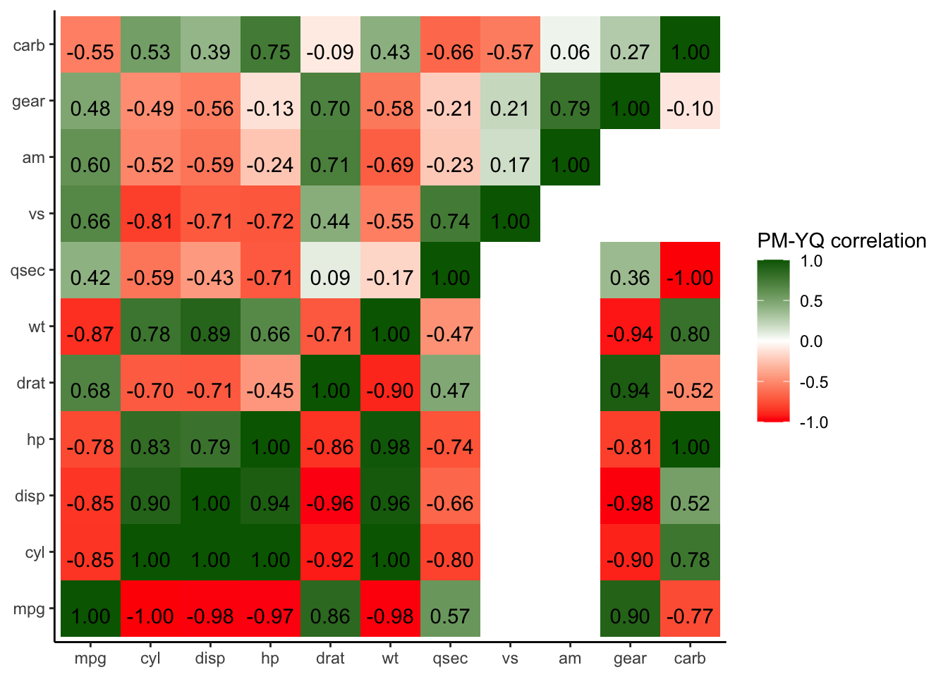
Figure 4.35: Combined heatmap PM-YQ